Risk analysis : a score, and why
"Risk analysis" page
This page answers one simple question: "overall, where do we stand?". It gives a score, and above all explains where it comes from. Two tabs.
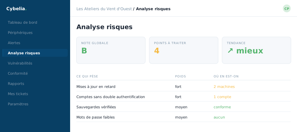 The risk score, and above all what makes it up: what weighs, and where things stand.
"Risk scores" tab
A large circle shows your fleet's overall score, a weighted average across all your machines. Under the circle, the recipe is written out in plain sight: 35% comes from settings compliance, 40% from alerts, and 25% from critical vulnerabilities.
Two reassuring details come with the figure. First, the false positives you declared are taken out of the calculation: the score reflects your reality, not the noise. Second, disconnected machines are excluded, a switched-off laptop does not drag your score down.
The score is recalculated at least every four hours, and the page shows the time of the last calculation.
This score is for spotting a trend, not for judging yourself. What matters is not its absolute value but its movement from one month to the next. A score creeping upward is a company taking care of itself.
"Attack techniques" tab
The second tab sorts alerts against a worldwide reference of known attack methods. A heat map shows the families most often seen, and a table lists the techniques by number of detections.
On a healthy fleet this tab often reads "no technique detected". That is good news, not a breakdown: data only appears when matching alerts are generated. The screen explains this itself, rather than leaving you with an empty table.
In closing
A score on its own is useless; a score whose recipe you can see lets you act. Look at what weighs most in the calculation, fix that, and the score follows by itself.
Commenting is not enabled on this course.